DESIGNING ILLUSTRATIONS FOR
“Het Lied van Alchemie”

3. THE EXTERIOR

By the time I was finishing up the sixth and final miniature, the publisher reached out to me again. I should mention that a different artist was originally contracted to work on the cover (I’m not sure if that also included the edges). I had seen an early draft of the work before, and while working on the interior images I had modeled the university tower to follow that cover. The publisher eventually decided not to go with the final design, and was looking for an alternative direction for the exterior. They were hoping I could create something in line with the illustrations I had made for the inside. At this point, there were still about 2 or 3 weeks (I don’t recall exactly) until going to print.
The publisher forwarded me a few designs of covers they liked as inspiration. Some of those covers were full illustrations/paintings. I do adore those, especially the ones with landscapes (I’m originally a landscape painter). Had I had time to develop a full painting I would have liked to try my hand at it. I had, until this point, never done a cover design though, and given the timeline I decided to play it safe.
The other examples were those with geometric compositions and floating elements. Hallmarks of that type of cover include floral patterns, borders and scrollwork, often interspersed with thematic objects or animals, in comforting colors, and usually outlined thickly. I was already using the floral element for the interior miniatures so it seemed like a natural fit.
The first step (as I had learned from redesigning the frames earlier) was going to be figuring out the geometry of the major composition elements. I used Illustrator to lay in a foundation, and then rendered and painted the final design in Photoshop. I set up four separate files in Photoshop, separating the front, side, and back—which I then linked to in one master PSB file. Working with different files keeps me from paralyzing my computer (I use a lot of layers). The main file helped me keep the margins and overall style balanced. The smoke element was also created in the main file, to make sure it flowed smoothly across the sides.
Originally, I thought I wanted to prominently feature the statue that is central to the story and the city of Aethelburg. I had a vision of an art-deco inspired figure holding out a teapot, and tried several quick analogue sketches. I’m glad I did that first, because it quickly showed me that it was going to make fitting all the other mandatory elements, like the title and other text, a much more difficult job than I intended. I found the asymmetrical weight of the statue and the teapot difficult to balance across the composition. When I tried fitting the statue on the back of the cover I ran out of space for the blurb. The whole puzzle was giving me a headache.
Whenever that happens the solution is usually to take it back a step and simplify. There’s a job to do after all, and simplification helps to deliver it on time. I took out the idea of the figure altogether, and placed the focus on the teapot. Like with the miniatures, I found inspiration in metalwork (Google champlevé, it’s gorgeous) and decided to embellish the teapot.
I actually wasn’t sure about the teapot handle in the beginning. I was still hoping I could make a top-handle work somehow, but in the end that got too complicated, so I just went for one on the side. It actually balanced the nozzle of the teapot in the composition a bit better, so I think I made the right call there.

“Behold! The tea is made.”

When your DnD character has fire resistance and brings in the hot tea.

The analogue sketch process can be messy.

Base geometry, at some point during the process.
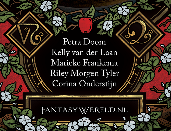
In line with the interior illustrations, I figured the background should be a rich black and the floral motif would be a style of apple blosom. I knew we wouldn’t be printing with actual goldfoil (maybe for the anniversary of the anniversary edition?), so I’d have to use color to render the gold inlay. I found a relatively easy combination of Photoshop techniques that make for a decent gold appearance. After an initial color sketch, I set out the rendering process. It was a fairly straightforward process, and I don’t want to bore anyone with too many technical details.
Earlier versions had more blue in the design as an accent color, most notably in the spine and on the back of the cover. We shifted away from that for the final print as it became a distraction from the text on the page.

Fun fact: the two symbols on the front are variations on the alchemical symbols for Aqua Regia (left) and Quintessence/Aether (right), meant to symbolize the contrast between alchemy and magic.