
DESIGNING ILLUSTRATIONS FOR
“Het Lied van Alchemie”

2. THE MINIATURES

While I was still putting the finishing touches on the map, the publisher reached out to me. As it turned out, they were thinking of commissioning illustrations to mark each section of the story. They liked what I’d been working on so far, and asked if I would have a go at it. It’s only the best gig in the world, so of course I said yes.
Their original idea was to have an icon or emblem to go with the title page for each act. Illustrators and graphic designers know that icons and emblems are actually quite tricky to make. The magic lies in their simplicity, and their simplicity (often) lies in their mathematical composition and smart use of symbolic shape language. Basically, use few shape to mean many thing. That’s tricky to design for (but usually simple to render). Though I’ve made a few for clients before, I don’t consider myself actually very good at them, and they often cost me a lot more time and headaches than I’d like to admit. Unlike a colleague of mine who can churn out a dozen mesmerizing brand logos a week, my brain turns simple shapes into paintings, and struggles the other way around. Fortunately for me, when I offered to make them miniature paintings instead, the idea was received with much enthusiasm, and nothing motivates me more than an enthusiastic client.
After consulting with my inside informant Corina, I had the idea that the first five miniatures would show the characters’ familiars, along with an object of importance to the story. The sixth act was, at that point, still in very early development, so I started sketching the first five and left that one for later, when more information would be available. After collecting reference materials for the objects I went straight for Photoshop and started sketching. I worked in a random order, first on Act 2, then 1, then 3, 5, and 4.
I tend to alternate between sketching and color blocking, especially when I’m still struggling to see the final design in my mind’s eye, but I was quite satisfied with some of the early compositions. Boosted by this wave of confidence I started rendering the subjects much more than I would have otherwise. When I got to the point where I could see the final rendering I ran into an issue. I had planned for some of the subjects to break through the frames and some to stay within them, using them to play with the illusion of depth. But as things progressed, I was having trouble applying this design uniformly across the illustrations. Some miniatures, like the butterfly and the anvil, were working relatively well, while others, like the dragon on the lute, stuck out like a sore thumb. The frames lost their purpose. I tried several days to ‘fold’ elements in and out. At some point, I hit a frustrating dead end and I put it away for a while.
Sketching things out with a pencil to mark the major shapes helped, and I decided I had to go back a step and reconsider the role of the frame. It was more important than I initially gave it credit for. I redesigned the frames from scratch, this time in Illustrator, and went for some more complex shapes. These new frames gave the illustrations a lot more room to breathe, and a horizontal band for a recurring floral motif made the illustrations feel more uniform. On a whim, I decided to add the ‘skyline’ for Aethelburg to round the design a bit more.


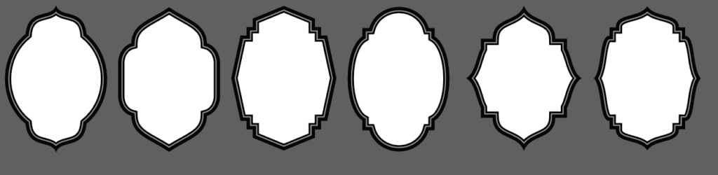
New frame designs, one for each miniature.

After some trial and error, the frame elements came together in Illustrator and all was well that day.
Because one of the characters is a decorative jewelsmith I wanted to take inspiration from metalcrafts. I’ve always been a big fan of the look of Indian koftgari, which is a metalworking technique that creates a striking contrast between a dark background and a gold or silver inlay. The technique goes by many names, and is popular across cultures and continents, but because I was first introduced to it as koftgari, that’s how I like to refer to it. It’s a cellar door in my book (though damascening isn’t bad either).
Before painting the apple blosom pattern in Photoshop I practiced with analogue tools, first sketching them out on paper with pencil and then roughly inking with pen.

Playing around with the shapes, I decided it would be fun to have the number of apple-clusters increase each act, as if the flowers were turning into fruits (yes, I know apples are actually determinate growers, but artistic license, please don’t hurt me). I always enjoy little details like that, and even if you don’t actively notice it as a reader, I think it subconsciously does something. In a world where things are increasingly cookie-cutter (or worse, AI generated), I like to think little details like that matter even more. I spend time on every leaf, every branch, and every petal, and try to give them as much love and consideration as much as an author does every word in a sentence.
By the time I got the notes for the sixth act, I understood the direction I wanted to go in, which made the design process the most straightforward of them all:

1) Initial frame, apples for scale. 2) Initial sketch. 3) Wider angle final sketch.

4) Grayscale blocking. 5) First shading pass. 6) Detail and rendering pass.

7) Texture pass. 8) Sculpting the dragon. 9) Almost there.

10) Done.
Here’s all six neatly together.


As an added bonus: the pages of the book for Act 3 contain some fun details. The left page contains a miniature inspired by the Narcissus tapestry in the Museum of Fine Arts Boston. The right page, sadly only partially visible, was written by Marieke Frankema. It excites me to know that the details in the image are lore-accurate, and I’m happy to be able to share the full text here:
“De eeuwige fonteinen van Yrian.
Rond deze fontein spelen vele legenden. Zo wordt gezegd dat het water het zuiverste water is dat stroomt in Fae, terwijl anderen beweren dat het water alles doet wat een gebruiker nodig heeft; het kan dorstlessend zijn, schoonmakend, maar ook geneeskrachtig werken of geheugenbevorderend. Het bewijzen van deze werking is tot nog toe onmogelijk gebleken; elke verwachting van onderzoekers is uitgekomen, wat tegelijkertijd voor en tegen de beweringen spreekt. Feit blijft dat zelfs een klein flesje water al een fortuin kost.”
